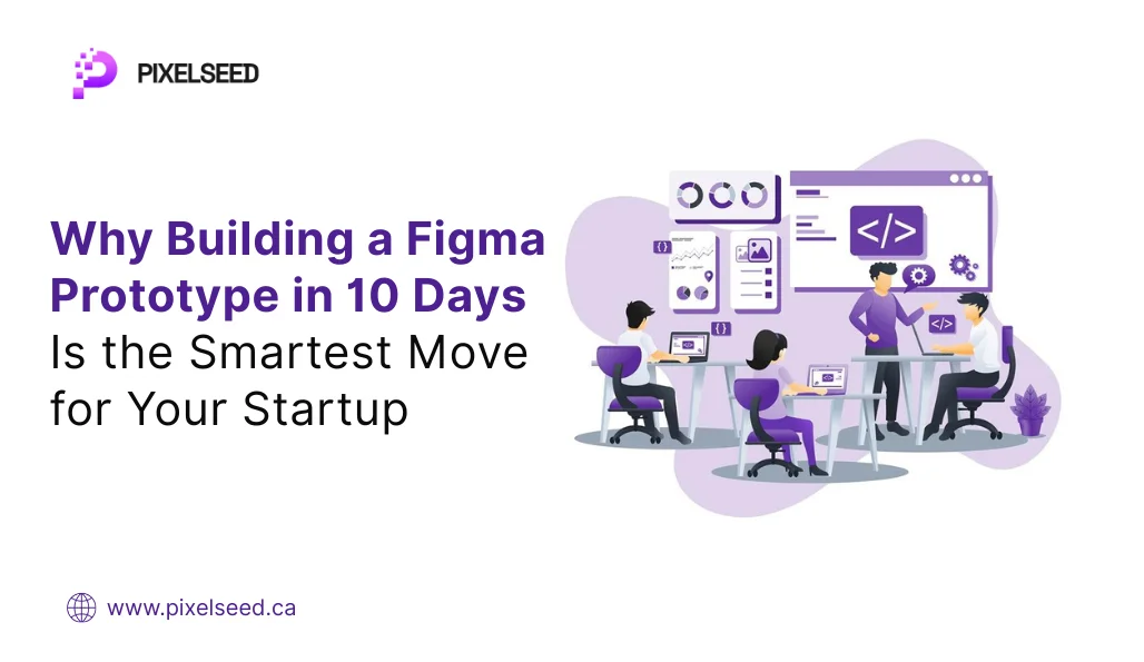
Why Building a Figma Prototype in 10 Days Is the Smartest Move for Your Startup
When you’re working on a new product idea, everything feels urgent. You want to move fast, test early, and impress investors. But pitching an idea with just words or slides rarely gets you far. If you’re serious about raising funds or validating your vision, you need to show, not tell.
That’s why building a clickable Figma prototype in 10 days is not just possible — it’s the smartest move you can make right now.
Let’s break it down in simple steps.
Why Prototypes Matter More Than Slides
A working prototype helps you skip the “we’ll build this later” conversation. Instead, you can say, “Here’s how it works.” It shows investors or early users that:
- You’ve thought through the experience
- You’re not stuck in planning mode
- You’re making progress — fast
Ideas are everywhere. Execution isn’t. A prototype makes your idea real enough to test, share, and improve.
The 10-Day Prototype Plan (No Code, No Fancy Tools)
You don’t need a big team to pull this off. What you need is clarity, focus, and a structured approach.
Day 1: Nail Down the Problem
Every good product starts with one clear problem. Not five, not three — just one. What’s the core issue you’re solving? Who faces it? If you skip this step, your prototype will feel scattered.
Ask yourself:
- What’s the user struggling with?
- How does your idea help?
- What are they currently using as a workaround?
The more specific, the better.
Day 2–3: Sketch the Flow
Start on paper or whiteboard — no screens yet. Map out how a user would go from problem to solution using your product. This helps you identify:
- Key screens (login, dashboard, checkout, etc.)
- User actions (tap, scroll, input, confirm)
- What matters most and what can wait
You don’t need a full app. Just the “happy path” — the ideal journey from start to finish.
Day 4–5: Wireframe in Figma
Now move to Figma. Create simple wireframes — basic black-and-white layouts that show structure, not design. Focus on:
- Navigation flow
- Button placement
- Screen connections
Wireframes strip away the polish and force you to think about logic. Does the flow make sense? Can a new user figure it out without asking questions?
If the answer is no, revisit your sketches before going further.
Day 6–7: Add Basic Visual Design
Next, apply color, fonts, and icons. You don’t need fancy graphics — just enough to make it feel real.
- Use consistent styles
- Keep spacing clean
- Avoid clutter
Your goal is clarity, not creativity. Each screen should feel easy to scan. Stick to one call-to-action per screen. If your user has to guess what to do, you’ve lost them.
Day 8–9: Link the Screens
Use Figma’s prototype feature to make your design interactive. When someone clicks a button, they should be taken to the next screen — just like in a real app.
This part turns your design from static to dynamic:
- Simulate user actions
- Show real navigation
- Mimic the actual app flow
This version is what you’ll use in demos, feedback sessions, and investor meetings.
Day 10: Test with Real People
Before you share it widely, ask a few real users (or even friends) to click through. Watch how they move through the prototype. Do they hesitate? Get confused? Miss something?
Use their feedback to:
- Fix confusing flows
- Reword unclear buttons
- Reorder screens if needed
Final touches matter. Polish the experience enough that a user understands the idea without any explanation from you.
What You Get in 10 Days
By the end of this sprint, you’ll have:
- A visual demo you can show to investors, users, or your team
- A clearer understanding of your product’s flow and logic
- A tool to collect real feedback without writing any code
- A faster path to validation — or redirection, if needed
This isn’t just a design exercise. It’s a way to reduce risk before spending on full development. You get answers without burning months and money.
Common Mistakes to Avoid
- Trying to include every feature: Focus on your product’s core. Extras can come later.
- Ignoring user flow: Fancy design doesn’t matter if users get stuck.
- Skipping feedback: You are not your user. Test early, test often.
- Over-polishing too soon: Get the structure right before you worry about gradients and shadows.
Final Thoughts
In early-stage product building, speed beats perfection. A simple prototype, built in 10 days, gives you real momentum. You move from “idea stage” to “execution stage” — and that’s where real learning begins.
If you’ve got a product idea in your head or notes on a napkin, stop polishing the pitch deck. Start building the experience.
Because when you show something people can click through, you shift the conversation from “What if?” to “When can we launch this?”
Build MVP Now
